
Financial information often feels dry and overwhelming when presented as raw numbers or spreadsheets. A clever visual design transforms complexity into clarity, turning data into compelling narratives. Readers find patterns, trends, and anomalies emerge naturally when numbers wear visuals instead of lists. through charts and graphs helps beginners and professionals spot opportunities and risks. Visual tools build relationships between figures, context, and decision-making. Curious minds gain insight faster when visuals lead the way rather than raw tables. In this blog, we will discuss the fundamentals of financial data visualization, understand its growing importance in the world of finance, and take a closer look at the different types of visual tools that help transform complex data into clear, actionable insights.
What is Data Visualization in Finance?
Data visualization in finance is a craft of transforming complex financial numbers into accessible visual forms. Visual formats such as charts, graphs, dashboards, maps, and interactive displays serve as lenses through which data becomes visible and understandable. Finance practitioners navigate risk profiles, asset performance, expense trends, cash flows, and portfolio behavior more effectively when raw inputs become visual stories. Creation of visual representations hinges on careful selection of chart types, scaling, color, and annotation. Communicating precise meanings through visuals demands an understanding of data relationships, temporal changes, distributions, and comparisons.
Importance of Data Visualization in Finance
Financial data becomes meaningful only when it can be understood and acted upon with confidence. Visualization bridges the gap between data overload and insight, helping finance professionals and stakeholders make better decisions at a faster pace. The following are the core reasons why visualization is essential in finance:
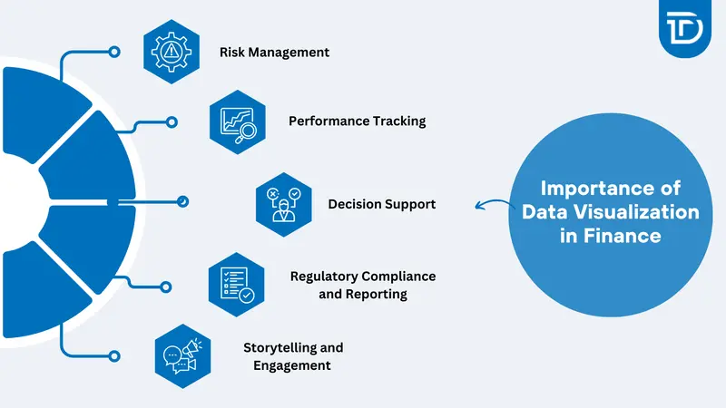
Risk Management
Visualization techniques reveal fluctuations in portfolio volatility, correlations among assets, and exposure drivers. Heatmaps or risk dashboards help highlight concentration risks or outliers lurking beneath aggregated metrics. Risk matrices and scatter plots often uncover hidden vulnerabilities that may not be obvious in spreadsheet data. Visual analysis supports quicker identification of systemic threats, allowing firms to rebalance portfolios or implement hedging strategies proactively. Dynamic charts also allow real-time tracking of financial shocks, enabling risk teams to remain agile and informed under market pressure.
Performance Tracking
Graphical trends, such as line charts for revenue growth or bar charts for expense breakdowns, communicate monthly or quarterly performance at a glance. Visual comparisons between actuals and forecasts help teams calibrate expectations and improve future projections. Layered visuals can show multiple performance indicators, such as revenue, net profit, and cost ratios, all within one dashboard to provide a holistic view. Time-series visualizations assist in identifying seasonality, emerging trends, or dips that require managerial attention. Performance visuals promote alignment between finance, operations, and strategy teams.
Decision Support
Interactive dashboards enable users to explore “what-if” scenarios. Dragging sliders for forecasted interest rates or inputting macroeconomic variables generates real-time chart updates that support strategic choices. Decision-makers can simulate different investment paths or capital allocations visually, understanding the consequences without diving into raw data. Scenario modeling, sensitivity analysis, and pivot visualizations help build confidence around high-stakes financial decisions. With the right data visualization service providers, even complex decisions become clear, actionable, and easy to communicate across all stakeholders.
Regulatory Compliance and Reporting
Financial regulators often demand clarity in disclosures. Visual aids such as waterfall charts or compliance scorecards enhance stakeholder trust by presenting data transparently and memorably. Regulatory reports become more accessible when complex taxonomies, audit trails, or exposure summaries are shown in chart form. Dashboards built for compliance allow for drill-down into flagged items or threshold breaches instantly. Real-time reporting visualization tools ensure that reporting stays current, reducing the risk of missed updates or reporting gaps that could lead to penalties.
Storytelling and Engagement
Investors, board members, and clients respond better when visuals illustrate narratives such as growth stories, value erosion, or strategic shifts. Narratives grounded in charts become memorable and motivate action. A compelling story built from numbers fosters trust and engagement far beyond a table of figures. Visualization acts as the language of finance when audiences lack deep technical knowledge. Whether it is showing a turnaround, highlighting market opportunities, or revealing inefficiencies, strong through visuals communicates purpose and direction in ways raw data cannot.
What Are the Different Types of Financial Data Visualizations?
Financial data visualization needs to be tailored based on the data and its purpose. Different types of charts and graphs serve different analytical purposes, each offering unique advantages depending on the data being presented and the audience it serves. Financial data can be represented through several key visualization types that help simplify complex information for better analysis and decision-making:
Line Charts
Line charts depict temporal trends such as revenue growth over months, stock price evolution, or interest rate changes. Smooth lines visualize patterns and turning points, enabling awareness of seasonality or emerging trajectories. These charts are ideal for illustrating data over continuous intervals. They help users detect momentum, performance cycles, or trend reversals. Line charts are commonly used in forecasting and budgeting discussions.
Bar Charts and Column Charts
Bar and column charts compare discrete categories such as expenses across departments, regional revenues, or segment contributions. Horizontal bars offer better readability when category names are long. Vertical columns highlight comparative magnitudes over time. These visualizations are especially effective for presenting rankings, deviations, or categorical breakdowns. Grouped or stacked formats show part-to-whole relationships or historical changes across multiple categories.
Pie Charts and Donut Charts
Pie and donut charts break down portfolios by asset class, expense categories, or revenue streams. These visuals are useful when illustrating parts of a whole, although clarity decreases when segments are too many or values are too close. They are best suited for high-level summaries where simplicity matters. Donut charts can also include additional data labels at the center for more context.
Heatmaps
Heatmaps show intensity values such as volatility levels, credit scores, or risk exposures across regions or instruments. Color gradients make it easy to spot areas with high or low intensity. These visuals are excellent for identifying clusters of risk or opportunity quickly. Finance teams use them to monitor performance across multiple departments, track metrics over time, and spot inefficiencies or operational gaps.
Scatter Plots with Bubble Sizes
Scatter plots represent relationships between two variables such as return versus risk. Bubble size typically indicates market capitalization or transaction volume. Visual clusters help reveal patterns, gaps, or outliers. These charts are useful for portfolio managers analyzing asset dispersion or identifying investments that offer high returns with reasonable risk. They assist in visualizing correlation strength and potential trade-offs between key financial indicators.
Waterfall Charts
Waterfall charts build a narrative around incremental changes. They typically start from gross profit, subtract cost of goods sold, operating expenses, and taxes, and end at net profit. This type of chart clearly shows how each component contributes to the final outcome. They are ideal for financial reporting, P&L breakdowns, and variance analysis. Waterfall charts offer transparency by showing what drives increases or decreases in values.
Candlestick Charts
Candlestick charts are often used in trading to show the open, high, low, and close prices for a specific time interval. Traders analyze visual patterns such as doji, hammer, or engulfing formations to assess potential market trends or reversals. These charts provide deeper detail than simple line charts by capturing price behavior within a defined period. They are essential tools for technical analysts for short-term traders.
Treemaps
Treemaps display hierarchical financial data such as sector weightings within a portfolio. They use nested rectangles sized by value and color-coded by performance or risk to create a structured view. This allows for easy comparison between segments of various sizes. Treemaps help investors and analysts quickly identify overexposed areas, underperforming sectors, or imbalances in asset allocation.
Dashboards
Dashboards combine multiple chart types into a single, interactive interface. Users can filter data by time period, financial entity, or performance scenario. Real-time dashboards enable continuous monitoring of metrics such as liquidity, profit and loss, or key financial ratios. Dashboards are widely used across departments, from CFOs to analysts, and provide a centralized platform for decision-making and performance tracking.
Top 5 Financial Data Visualization Tools
Visualization becomes powerful when paired with tools designed for finance-specific context and interactivity. Whether used by analysts, CFOs, or developers, the right tool can significantly improve data clarity and communication. Here are the top five financial data visualization tools most trusted in the financial sector for their performance, flexibility, and precision:
Tableau
Tableau begins with a user-friendly drag and drop interface and adapts with dashboards that work seamlessly across departments and decision-makers. Live data connections to Excel, databases, or market data APIs keep visuals fresh and responsive. The tool also supports calculated fields, parameter controls, and trend lines. Its real-time sharing capabilities and mobile responsiveness make Tableau a favorite among finance professionals needing deep insights without coding dependencies.
Power BI
Power BI makes integration with Microsoft ecosystems seamless, enabling faster access to critical business data. Visualizations tied to Azure or SQL Server and built-in templates for financial reporting simplify dashboard creation. It offers strong compatibility with Excel models and DAX for advanced analysis. Power BI integrates smoothly into Microsoft Teams, SharePoint, and Office 365, making it an accessible yet powerful choice for enterprise finance teams.
Qlik Sense
Qlik Sense offers associative analytics that uncover hidden patterns through in-context selection across diverse data points. Its intuitive exploration supports faster decision-making and reduces data silos. Self-service visualization empowers finance teams to create insights without relying heavily on IT departments. Its responsive design, automated suggestions, and prominent governance features make Qlik a strong candidate for organizations focused on agility and user-driven analysis.
Plotly (Dash)
Plotly, particularly its Dash framework, is built for creating interactive web-based visuals with high levels of customization. Python or R developers can script dynamic charts that are responsive, stylable, and embeddable into web portals or internal dashboards. Dash supports data callbacks, user inputs, and real-time interactivity. Its flexibility makes it suitable for creating complex financial applications like pricing models or investment analysis tools tailored to specific business needs.
Highcharts / Highstock
Highcharts and Highstock are JavaScript libraries specialized in financial chart types such as candlesticks, OHLC, and time-series. These tools are highly customizable and optimized for performance. Developers frequently embed them into trading platforms, investor portals, or financial dashboards. The libraries support interactivity, real-time data updates, and multiple axes. Their lightweight nature and compatibility with all major browsers make them ideal for fast, efficient financial data visualization in digital products.
Best Practices for Financial Data Visualization
Effective visualization demands thoughtful execution across design, context, and clarity. Ensuring visuals communicate the right message without confusion requires discipline in both aesthetics and accuracy. The following are best practices to follow when visualizing financial data:
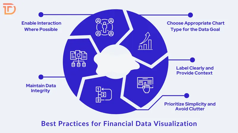
Choose Appropriate Chart Type for the Data Goal
Selecting the right chart type is crucial for conveying the intended message clearly. For example, bar charts excel at illustrating time series data while pie charts work well for showing composition. Using the wrong chart type risks confusing or misleading viewers. Matching the data story with an appropriate visual form enhances understanding and decision-making.
Label Clearly and Provide Context
Every chart should have clear titles, axis labels, legends, and annotations where needed. Including dates, units, or currency symbols prevents misinterpretation of financial metrics. Contextual notes or explanations help highlight significant progress or anomalies, allowing viewers to grasp insights faster without additional explanation.
Prioritize Simplicity and Avoid Clutter
Removing unnecessary elements such as excessive gridlines, distracting colors, or 3D effects sharpens focus on the data itself. A clean, minimalist layout with ample white space helps prevent information overload. Simplified visuals are easier to comprehend quickly, allowing users to draw insights without struggling to separate signal from noise.
Maintain Data Integrity
Visualizations must be honest and transparent. Avoid truncating axes or using distorted scales that exaggerate or minimize differences. Consistent scales and zero baselines preserve fairness, ensuring viewers perceive magnitudes and trends accurately without bias or distortion.
Enable Interaction Where Possible
Interactive features like zooming, tooltips, filters, and drilldowns allow users to explore data at their own pace. These controls make it easier to tailor views by date ranges, regions, or asset classes, enhancing engagement and supporting deeper analysis without overwhelming initial displays.
The Bottom Line
Financial data transforms into insight when visuals communicate more effectively than raw numbers. Visual makes trends, relationships, and risks immediately visible. Choosing the right chart type, tool, design approach, and clarity enhances decision‑making and reduces analysis time. Tools such as Tableau, Power BI, Qlik Sense, Plotly, and Highcharts offer flexible options across user capabilities. Design matters as much as data; best practices around labeling, color, interaction, integrity, and accessibility ensure that visualizations serve truth rather than distort meaning. Well-designed visuals improve engagement across finance teams, leadership, and clients alike.
As a leading provider of data visualization consulting services, Dreamer Technoland transforms your financial data into clear, interactive, and impactful visuals. Skilled in both visualization design and financial context, we help you build intuitive dashboards, select the right tools, and ensure your visuals support confident decision-making. Whether the setup involves Tableau dashboards, embedded Power BI reports, custom Plotly interfaces, or dynamic Highstock charts, we’ve got you covered. Businesses, professionals, and financial institutions seeking clarity, speed, and elegance in financial reporting consistently find real value in our data visualization services.