
Data is growing faster than ever. Every business today collects information from websites, mobile apps, payment systems, customer interactions, cloud platforms, and even connected devices. From online purchases and customer feedback to operational reports and supply chain data, organizations are constantly generating valuable information that can influence important decisions.
However, the problem is not collecting data. Most companies already have access to more information than they can properly manage. Instead, the real challenge is understanding it in a simple and useful way.
Raw numbers stored in spreadsheets or databases do not automatically create value. In fact, without proper structure and presentation, even the most important insights can remain hidden.
That is why big data visualization techniques have become essential in 2026. It helps businesses turn large and complex datasets into visual dashboards, charts, and maps that anyone can understand.
As a result, when data is presented clearly, teams can make faster decisions without getting lost in technical details. Now, let us understand the roots of this subject in detail.
What Is Big Data Visualization and Why Does It Matter in 2026?
Big Data Visualization is the process of converting massive datasets into visual formats so people can understand insights quickly. In other words, instead of reading thousands of rows in a spreadsheet, users can see patterns through charts, graphs, and dashboards.
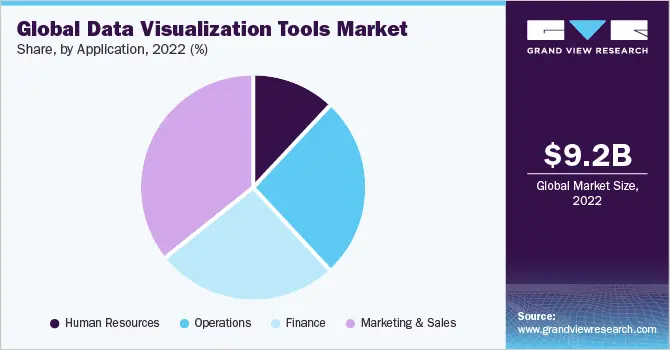
In 2026, businesses depend heavily on real-time insights. Today, leaders cannot wait for weekly reports. They need clear and instant information to respond to market changes, customer behavior, and business risks. This rising demand is also visible in market growth. According to Grand View Research, the data visualization tools market was valued at USD 9.22 billion in 2023 and is expected to reach USD 22.12 billion by 2030, which shows that more businesses are investing in visualization to understand their data easily and quickly.
Visualization matters because it:
- Makes complex data easier to understand
- Reduces decision-making time
- Improves collaboration between technical and non-technical teams
- Supports data-driven strategies
Therefore, these advantages are closely related to the overall Benefits of Data Analytics, because when businesses clearly understand their data, they can work more efficiently, reduce risks, make better decisions, and increase their profits.
What Are the Most Effective Big Data Visualization Techniques in 2026?
Modern big data visualization techniques focus on clarity, interactivity, and intelligence. Instead of static graphs, businesses now use dynamic dashboards that allow users to explore data in detail.
Below are the most effective techniques shaping 2026.
Real-Time Dashboards
Real-time dashboards update automatically as new data enters the system. This is especially useful in industries where timing matters, such as retail, finance, and logistics.
For example, an e-commerce company can monitor:
- Live sales performance
- Website traffic trends
- Payment success rates
- Inventory levels
Consequently, if something unusual happens, the team can respond immediately.
Interactive Data Exploration
Similarly, interactive dashboards allow users to filter data based on time, region, product, or customer segment. As a result, this makes analysis more flexible and personalized.
Instead of showing one fixed report, users can explore different perspectives. Moreover, this approach supports better understanding across departments and aligns with discussions around Business Analytics vs Business Intelligence, where analytics focuses more on forward-looking insights.
AI-Powered Visualization
In addition, artificial intelligence now plays a strong role in visualization. Modern platforms can suggest the best chart type based on the dataset. Furthermore, they can also highlight trends, detect unusual patterns, and provide predictive insights.
Because of this, manual effort is reduced and users can focus more on decision-making rather than formatting data.
Geospatial Mapping
Geospatial visualization uses maps to display location-based insights. For instance, businesses use it to analyze regional performance, customer concentration, and delivery routes.
One of the most common big data visualization examples is a retail brand using heat maps to identify high-demand areas before opening new stores.
Network and Relationship Graphs
Likewise, network graphs visually represent relationships between data points. These are commonly used in cybersecurity and fraud detection.
For example, financial institutions use network graphs to:
- Identify suspicious transaction patterns
- Detect hidden fraud networks
- Analyze account relationships
As a result, these visuals simplify complex connections that would otherwise be difficult to interpret.
Which Big Data Visualization Tools Are Leading in 2026?
Choosing the right platform is critical for success. Since different businesses require different levels of customization, scalability, and cost control, selecting the right tool becomes important.
Here are the most widely used big data visualization tools in 2026.
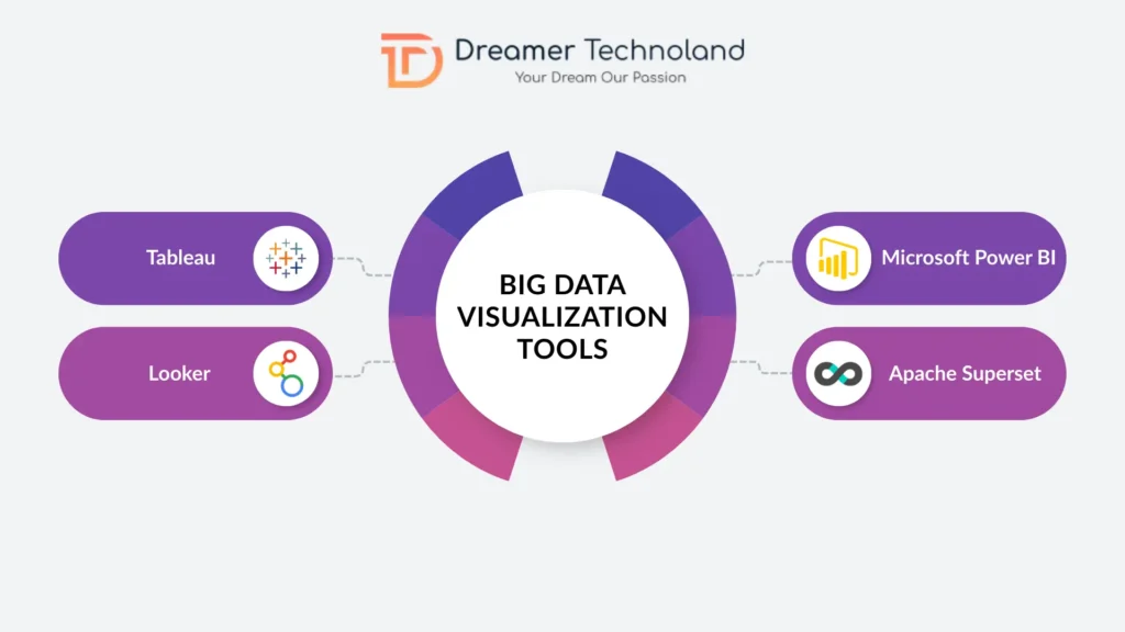
- Tableau: Tableau is known for its powerful and user-friendly interface. It allows users to create interactive dashboards without complex coding. Therefore, large enterprises often choose it for advanced analytics and strong integration capabilities.
- Microsoft Power BI: Microsoft Power BI is widely adopted because of its smooth integration with Excel and Azure services. In addition, it is considered cost-effective and suitable for small and medium businesses as well as large enterprises.
Consequently, many companies evaluate features alongside factors such as Power BI dashboard development cost before selecting this solution.
- Looker: Looker is a cloud-based platform that focuses on embedded analytics. As a result, it is especially useful for SaaS companies that want analytics integrated directly into their applications.
- Apache Superset: Apache Superset is an open-source platform preferred by engineering teams. Therefore, it provides flexibility, customization, and SQL-based exploration without high licensing costs.
How Is Big Data Visualization Used Across Industries?
Almost every industry benefits from visualization because every industry generates data. Therefore, the use of dashboards and visual tools continues to grow across sectors.
Finance
Data Visualization in Finance helps banks and financial companies see important information in real time. As a result, they use dashboards to track risk, investments, and daily transactions so they can make quick and correct decisions.
For example, portfolio performance tracking helps managers see whether their investments are making profit or loss. Similarly, fraud detection monitoring helps banks quickly find unusual or suspicious transactions.
In addition, risk exposure analysis shows how much financial risk the company is facing at a certain time. Furthermore, compliance reporting becomes easier because all required financial data is clearly shown in one place.
Therefore, clear and simple visuals help executives understand complex numbers without needing deep technical knowledge.
Retail and E-Commerce Businesses
Retail companies use dashboards to better understand their customers and improve sales. As a result, visualization helps them see what products are selling well and what customers prefer.
Demand forecasting helps businesses predict which products will be popular in the future. Moreover, customer segmentation helps companies group customers based on their buying behavior so they can offer personalized deals.
In addition, inventory management becomes easier because businesses can see stock levels in real time. Similarly, campaign performance tracking helps marketing teams understand which advertisements or promotions are working best.
Therefore, these are practical big data visualization examples that clearly show how businesses can increase profits and reduce losses.
Healthcare
Healthcare organizations use dashboards to manage patients and hospital resources more effectively. As a result, visualization helps doctors and administrators see important information quickly and clearly.
Patient data tracking allows medical staff to monitor health records, test results, and treatment progress. In addition, bed capacity monitoring helps hospitals manage available beds and avoid overcrowding.
Furthermore, treatment effectiveness analysis helps doctors understand which treatments are giving better results. Likewise, outbreak detection dashboards help health authorities track the spread of diseases and respond quickly.
Consequently, real-time insights help improve patient care and overall hospital management.
What Are the Major Challenges of Big Data Visualization?
Despite its advantages, there are important challenges of big data visualization that organizations must address carefully.
The most common challenges include:
Handling large amounts of data without slowing down the system
Businesses create a huge amount of data every day. Therefore, if the system is not strong enough, dashboards may become slow or stop updating properly. When this happens, teams cannot make quick decisions.
Making sure the data is correct and consistent
Visualization is only useful if the data isaccurate. However, if there are mistakes, missing details, or duplicate entries, the charts and reports can show the wrong information. Therefore, clean and correct data is very important for reliable results.
Avoiding crowded dashboards with too much information
When too many charts and numbers are shown on one screen, people can get confused. Hence, a good dashboard should only show the most important information so users can understand it easily.
Keeping data secure and following privacy rules
Many businesses work with sensitive information like financial details or personal records. Therefore, they must protect this data properly and follow all privacy and security laws to avoid problems.
As a result, poor design can reduce clarity instead of improving it. Effective visualization focuses on simplicity and relevance.
How Do Big Data Visualization Services Support Business Growth?
Many organizations rely on professional big data visualization services to design scalable and customized analytics systems. Instead of simply creating charts, these services align dashboards with business goals.
Modern services typically focus on:
- AI-enabled insights
- Cloud-based architecture
- Role-based dashboard access
- Long-term scalability
Therefore, with the right strategy, businesses can build systems that grow with their data needs.
How Do Different Types of Data Analytics Strengthen Visualization?
Understanding the Types of Data Analytics helps explain how visualization creates value.
The four main types include:
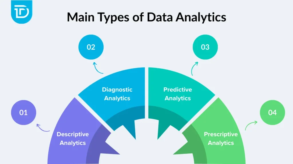
- Descriptive analytics, which explains what happened
- Diagnostic analytics, which explains why it happened
- Predictive analytics, which forecasts future outcomes
- Prescriptive analytics, which recommends actions
As a result, visualization supports all these stages by presenting information clearly and understandably. In addition, it also supports the discussion around Business Analytics vs Business Intelligence, where business intelligence focuses on historical reporting and analytics emphasizes forward-looking decision-making.
Final Thoughts
In 2026, having a lot of data is not enough. What really matters is understanding that data clearly and using it to make better decisions. Businesses that use the right Big Data Visualization techniques and tools can quickly see what is working, what is not, and where new opportunities are waiting.
Clear dashboards and simple visual reports help teams avoid confusion. They make it easier to track performance, reduce risks, and plan for the future with confidence. But getting the best results depends on choosing the right tools and setting them up in the right way.
This is where the right support becomes important. Dreamer Technoland helps businesses turn complex data into simple and useful dashboards that truly support their goals. The focus is not just on creating charts, but on building solutions that help companies grow and make smarter decisions every day.
When your data is clear, your decisions become stronger. And that is what helps businesses move forward with confidence.
Frequently Asked Questions
Q. What is Big Data Visualization?
A. Big Data Visualization is the process of converting large datasets into visual formats such as dashboards, charts, and maps to make insights easier to understand.
Q. Which industries use big data visualization tools the most?
A. Industries such as finance, retail, healthcare, manufacturing, and logistics use visualization extensively because they manage large amounts of data daily.
Q. What are the biggest challenges of big data visualization?
A. The biggest challenges include managing high data volumes, maintaining data accuracy, avoiding dashboard clutter, and ensuring security compliance.
Q. How do big data visualization techniques improve decision-making?
A. Big data visualization techniques simplify complex information, allowing decision-makers to identify patterns, detect risks, and respond quickly.
Q. Are big data visualization services useful for small businesses?
A. Yes, small businesses can benefit from professional services if they lack in-house expertise. Properly designed dashboards help them grow efficiently and make informed decisions.