

Marketing today is driven by data, with campaigns producing a constant stream of information from multiple channels such as social media, email, and search engines. While this data holds the key to understanding audience behavior and campaign effectiveness, its sheer volume and complexity often make it difficult to interpret. Raw numbers and spreadsheets can overwhelm marketers, slowing down visualization for decision-making and masking valuable insights. Data visualization offers a powerful solution by turning complex data into visually compelling stories that make sense at a glance. When marketing data is presented visually, patterns and trends become easier to spot, enabling teams to react faster and smarter.
Visualizations provide a clear snapshot of campaign performance, making it simple to identify what is working, what needs adjustment, and how to allocate resources more efficiently. Smarter decisions replace guesswork as teams lean on data-driven marketing insights to guide every move. With the right approach to data visualization, marketers can move beyond guessing and assumptions, using hard evidence to guide every strategic choice. This blog will walk through the essentials of data visualization in marketing and share practical tips to help you track campaign performance with ease and confidence. In this blog, we’ll discuss what data visualization in marketing is, its benefits, why it’s essential for marketing strategies, seven effective types of marketing data visualizations to include in your reports, and useful tips for creating engaging and impactful visual content.
What is Data Visualization in Marketing?
Data visualization in marketing involves presenting marketing data through graphical or pictorial formats, such as charts, graphs, heat maps, and dashboards. These visuals allow marketers to interpret trends, patterns, and performance metrics without sifting through endless spreadsheets. Rather than analyzing raw numbers, data visualization creates a story around marketing campaigns, highlighting data-driven marketing insights with clarity and speed. It’s a bridge between data complexity and decision-making simplicity, designed to help teams optimize campaigns and maximize ROI.
Benefits of Data Visualization in Marketing
Marketing data can be overwhelming, especially when it comes from multiple sources and formats. Data visualization transforms complex information into clear, digestible visuals that simplify analysis and improve understanding. The following are some of the key benefits marketers gain when leveraging data visualization:
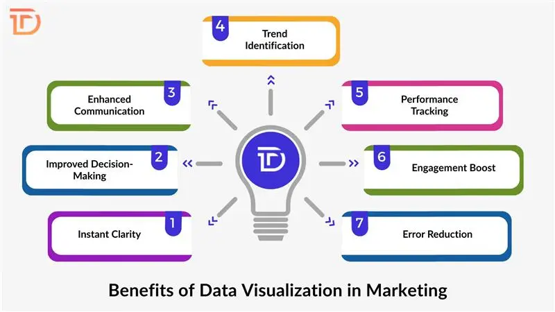
Instant Clarity
Visual formats transform raw, complex data into easy-to-understand insights. This clarity allows marketers to quickly grasp how campaigns are performing without getting lost in numbers, helping them focus on key metrics and make timely decisions to boost results.
Improved Decision-Making
Access to real-time analytics visualization empowers marketing teams to make faster, more informed decisions. Visual insights reveal what’s effective and what isn’t, allowing strategies to be adjusted promptly based on accurate, up-to-date information rather than assumptions or outdated reports.
Enhanced Communication
Data visualization tools create a shared language among marketing teams, stakeholders, and clients. Presenting information visually bridges gaps in understanding, fostering clearer communication and collaboration. This shared clarity ensures everyone stays aligned on campaign goals and performance outcomes.
Trend Identification
Visual data highlights patterns, shifts, and emerging trends in customer behavior that might be missed when looking solely at spreadsheets. Spotting these trends early enables marketers to anticipate changes, refine targeting, and stay ahead of competitors in a rapidly evolving market.
Performance Tracking
Dashboards and other visualization tools offer continuous monitoring of critical campaign metrics. Keeping track of these indicators in campaign tracking dashboards ensures marketing goals are met, resources are efficiently allocated, and budgets are optimized to achieve maximum return on investment.
Engagement Boost
Well-designed visuals capture attention and enhance engagement during presentations and reports. They help marketers convey complex data in an appealing way, making it easier to win support from leadership and stakeholders for ongoing campaigns or new marketing initiatives.
Error Reduction
Automating data visualization processes reduces the risk of human error that often occurs during manual data compilation and analysis. Accurate visual reporting ensures marketers rely on trustworthy data, avoiding costly mistakes caused by misinterpretation or incorrect figures.
Why is Data Visualization Essential for Marketing Strategies?
Marketing strategies thrive on data, but raw numbers alone don’t tell the whole story. Visualization transforms data into narratives that reveal customer journeys, campaign successes, and areas needing improvement. Interactive dashboards allow marketers to drill down into specific metrics, uncovering hidden insights. Campaign optimization depends heavily on understanding these insights quickly to tweak messages, reallocate budgets, or target audiences more effectively. Visualization creates a dynamic feedback loop, turning data into a strategic asset rather than a static report. The ability to visualize complex datasets also supports analytics dashboards for businesses, where fast responses to market changes define success.
7 Marketing Data Visualizations to Use in Your Reports
Effective data presentation helps marketers quickly understand and act on campaign results. Using the right type of visualization makes complex data clear and actionable. Below are seven powerful visual tools to improve your marketing reports and insights.
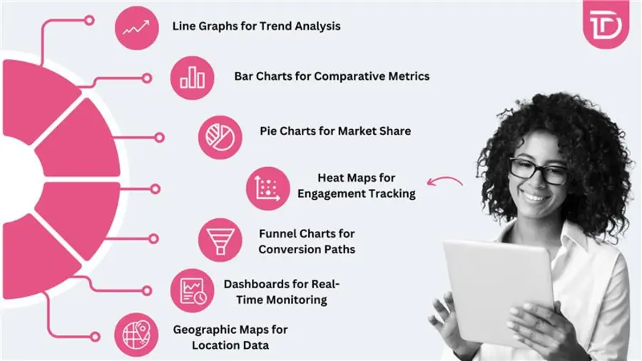
Line Graphs for Trend Analysis
Line graphs clearly show changes in performance over time, helping marketers track metrics such as website traffic, engagement, or conversion rates throughout a campaign. Identifying upward or downward trends becomes intuitive, enabling timely adjustments to strategy.
Bar Charts for Comparative Metrics
Bar charts offer an effective way to compare different campaigns, marketing channels, or audience segments side by side. This clear visual distinction makes evaluating performance across categories straightforward, helping marketers decide where to focus efforts or budget.
Pie Charts for Market Share
Pie charts illustrate proportions within a whole, making them ideal for displaying market share, audience demographics, or revenue distribution across products or services. They provide a quick snapshot of how different elements contribute to overall success.
Heat Maps for Engagement Tracking
Heat maps visually represent user interactions on websites or emails, highlighting areas that receive the most clicks or attention. Understanding these “hotspots” helps marketers optimize layout and content placement to boost user engagement and conversions.
Funnel Charts for Conversion Paths
Funnel charts map out each stage of a customer’s journey, from awareness to purchase. These visuals help identify where potential customers drop off, providing critical insights for optimizing the sales process and improving conversion rates.
Geographic Maps for Location Data
Geographic maps display campaign performance across different regions, helping marketers understand where their efforts resonate most. These visuals support tailoring messages or allocating resources based on geographic trends and market potential.
Dashboards for Real-Time Monitoring
Interactive dashboards bring multiple key metrics together in one place, offering an at-a-glance overview of campaign performance. They enable marketers to monitor results continuously, react quickly to changes, and keep all stakeholders informed with up-to-date real-time data monitoring tools.
Tips to Make Engaging Marketing Data Visualizations
Creating visually appealing charts is only half the battle. Effective data visualization also depends on clarity, usability, and the ability to tell a compelling story. Strong visuals should make insights easier to understand and act upon. The following are some practical tips for creating engaging marketing data visualizations.
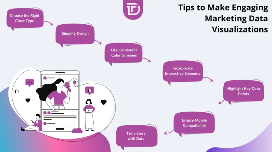
Choose the Right Chart Type
Selecting the appropriate chart or graph for your data ensures clarity and prevents confusion. Different data types and insights call for specific visualization styles. Matching your message to the right format helps your audience grasp information quickly and accurately, making your reports more effective.
Simplify Design
Keeping your visuals clean and focused is essential. Remove unnecessary elements that don’t add value or may distract the viewer. Highlight key metrics clearly to maintain the audience’s attention and ensure your message comes across without overwhelming them with too much information.
Use Consistent Color Schemes
Consistent use of colors strengthens brand identity and makes data easier to interpret. Using a coherent palette across all visuals helps viewers associate colors with specific metrics or categories, reducing confusion and speeding up comprehension during presentations or reports.
Incorporate Interactive Elements
Adding interactive features like filters, tooltips, and drill-down options allows users to explore the data more deeply. These elements encourage engagement and enable personalized insights, helping decision-makers dive into specifics and discover trends that static charts might miss.
Highlight Key Data Points
Draw attention to the most important figures or trends within your visualization. Use size, color, or annotations to emphasize these critical insights, guiding viewers to what matters most. This technique helps focus discussions and decision-making on the key aspects of campaign performance.
Ensure Mobile Compatibility
Design visuals to be accessible and easy to navigate on all devices, including smartphones and tablets. Mobile-friendly data visualizations ensure that stakeholders and marketers can review reports anytime, anywhere, without losing clarity or functionality.
Tell a Story with Data
Present your data within a narrative that connects insights to real-world marketing actions. Storytelling with data helps translate numbers into meaningful context, making it easier for audiences to understand why the data matters and what steps should be taken next.
Final Words
Tracking marketing campaign performance can quickly become overwhelming without the right tools. Data visualization offers an intuitive way to transform complex marketing data into accessible insights. Using various visualization types like line graphs, dashboards, and heat maps, marketers gain a clearer understanding of their efforts, enabling faster, smarter decisions that drive better results. Clear, engaging visuals not only improve internal communication but also help demonstrate campaign value to stakeholders effectively.
Dreamer Technoland offers data visualization consulting services tailored to meet unique marketing needs. Whether it’s building interactive dashboards or integrating real-time data feeds, our expertise helps businesses unlock the full potential of their marketing data. Partnering with us empowers your marketing team with tools designed to track, analyze, and optimize campaigns effortlessly, transforming data into growth. Reach out to explore how our data visualization services can elevate your marketing strategies today.